Client Overview
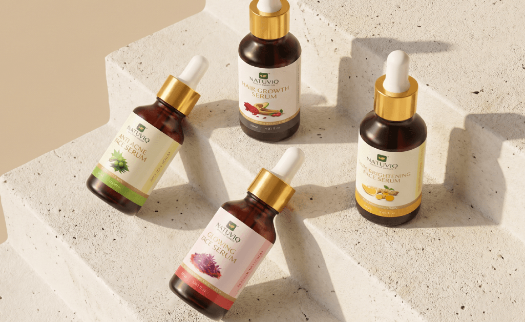
Natuviq is a wellness brand competing in a crowded, visually saturated market. The brand needed packaging that could hold its own on shelf while signaling the quality and trust modern consumers look for.
The Challenge
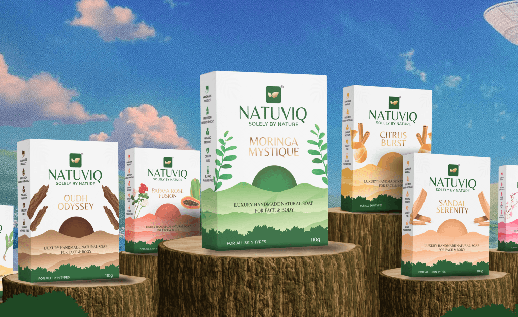
In a crowded wellness market, the brand needed a distinct visual identity to stand out on shelves and appeal to modern consumers – without an existing design system to build from.
Our Approach
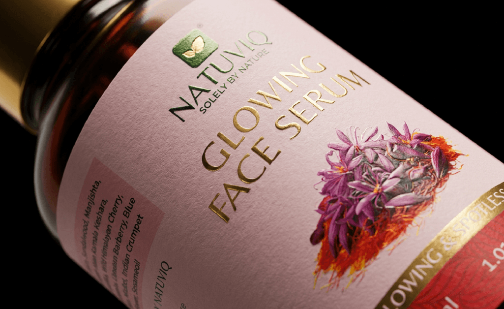
We rebuilt Natuviq’s packaging from the ground up, focused on clarity and shelf impact:
- Simplified and refined the visual language
- Focused on clarity, readability, and hierarchy
- Created a clean, premium aesthetic
- Designed for strong shelf presence and recall
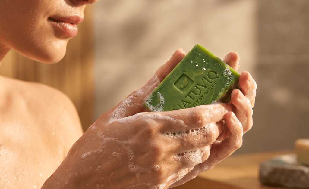
Packaging Showcase A packaging system designed to enhance visibility, perception, and brand value across the product range.
Impact
- Stronger shelf presence
- Improved product clarity
- Elevated premium perception
- Consistent visual identity across the range
A packaging identity built to work as hard on a crowded shelf as it does in a customer’s hand.